Link:
Category Post-Production
Short Film: Audience Review
Having finished editing “Split”, I sent it out via Whatsapp and Twitter to invite others to watch the film in order to get audience feedback. I didn’t conduct another Twitter poll (like I did for the website and postcard) because I wanted more specific, detailed responses from the audience. So, by sending the film individually to 30 people from different social and ethnic backgrounds, I could correspond with them one-on-one and find out what they thought.
On the whole, the responses were positive, with everyone saying they found the film to be entertaining and engaging. People generally seemed to like the aesthetic of the color scheme and lighting, and the editing. Nobody had trouble following the storyline or making sense of the ending, which was a personal relief to me. I wasn’t sure if people would get it, but they did, which made me happy. This assured me that the film was generally fine, and there was nothing major that I needed to change.
Here are some audience responses:
- “The camera angles and lighting are really good.”
- “The editing is accurate and the plot is also good. The only thing I would say is that there are maybe too many close-ups in the beginning. I know it adds to the plot, I’m just not a big fan of close-ups. But that’s besides the point. It was actually really good!”
- “That was creepy good.”
- “The editing was nice, especially in the last scene.”
- “It’s really well portrayed, and I love the aesthetic. The frames and colors are so good. The end is perfect.”
- “That was so well portrayed.”
- “I found it interesting.”
- “I liked the way you edited the dialogue and visuals together. The 360 degree shot was really cool to see.”
- “I really like it because it has a very surreal feel in the beginning which helps you realize their psychosis. In a couple of places the music felt a little too dramatic, but it does add to the intense effect so it works. The special effects in the end is so good. I love the abstractness. A boom mic would’ve helped make the audio a little clearer.”
- “It’s a really creative concept and the way you shot and unveiled everything is really cool.”
Title Design: Change
Looking back on the opening title sequence of “Split” after having started work on the website, I felt that the design didn’t really fit the theme of the film. While the red to blue shading does reflect the colours used in the movie, these colours are not used in any of the other promotional tools and seem out of place. The colour scheme of the website, which is primarily black, grey, and deep navy blue, is much more sophisticated. The red and blue used for the titles look cheesy in comparison and are appear too bright for a serious drama. While the choice seemed fine at the time, I have changed by mind and decided to modify the design of the title sequence. It is important for the same colours to be used in the website, poster, and titling as this how the marketing will have a clear relation to the film and build brand awareness.
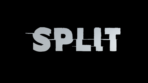
I am of course not changing the font, as the problem lies only with the colour scheme. So, I decided to go with a simple black background. Black is used in the website a lot, and conveys a sense of seriousness and darkness. These associations more accurately reflect the theme of the film than the red or the blue. The grey lettering against the black background has a simplistic, elegant look. It is much more aesthetically pleasing than the previous design.

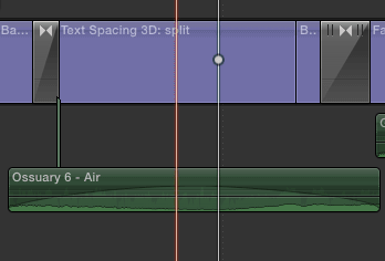
I have not changed the animation in any way. The letters still come together at the centre and then split to opposite sides. However, I have added some background music to liven up the animation and have the title sequence more gripping. I used a small section from “Ossuary 6”, which is one of the pieces of music I have used in the film itself. This way, the music doesn’t seem out of place and provides a smooth transition into the film.
Title and credits
The font I ended up using for the title of my film was the one I was leaning towards when I did my logo font brainstorming:

This font, called ‘Amateur Slash’ embodies the disordered feel of my film perfectly and has the look of being “split”, making it a fitting choice. It is bold, eye-catching and really looks like it could be a real film logo. Between these two versions, the second one is the one I prefer because the split lines look more aesthetically pleasing to me in that. So this was the variation of the font I decided to work with.
To design the title sequence of my film, I used Adobe Photoshop CS6 to create the background:

I created a fading effect from red to blue using the gradation tool because these colors represent the two major color schemes used in my film. Cool colors are used for the bedroom scenes and warm colors are used for the living room scenes, so I thought that this would be fitting. I spent a lot of time trying to find the right shades of red and blue. I wanted them to have a dark tint, because otherwise they look too happy and chipper. This would give audiences the wrong idea about the genre of my film.
Then, using the ‘Amateur Slash’ font which I downloaded and installed in Final Cut Pro X, I started work on the lettering. I made the letters 3D and added a shadow as this made the letters appear more dynamic. They really seem to pop off the screen. The color I chose was grey because grey looks the best against the red-blue backdrop. It is a neutral color that helps bring out the serious side of the film. I considered black (because black also works against the backdrop), but in this particular context, if I used black the shadows couldn’t be seen clearly, so I settled on grey.


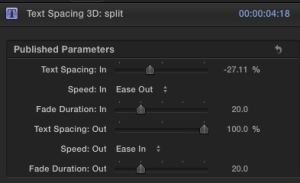
The text effect I used was called “Text Spacing”. With this effect the letters appeared to come from the sides and join together at the center, but what I really wanted was them to start from the center and split to the sides. So I adjusted the settings for the fade in, fade out and spacing to achieve the look I wanted.
So now, the letters start from a small clump and quickly fall into position before splitting off to the sides. This effect seemed like the right choice because the “splitting” of the letters aptly relates to the title “Split”.


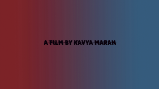
After this, I added the line “A film by Kavya Maran” using the same font. I didn’t change the font for any of the other text that appears in both the beginning and during the end credits because it would look jarring. The same font being used lends a sense of continuity. I used black for this because the lettering is not in 3D and there is no shadow to be seen. The black lettering differentiates this text from the title, but not in a manner that is jarring because the colors are all in the same family still. I used the “Fade in” text effect for this so that the transition wouldn’t be abrupt. When this line appears on the screen the sound of feet hitting the cupboard can be heart softly and it grows louder and louder. This sound is intriguing for audiences, and will provide a smooth transition into the film.
At the end of the film, I added:


The “Starring” credits roll up the screen, following the conventions of film credits. For the entire duration of the end credits the audio of “Twinkle Twinkle Little Star” sung by the young girl in the film plays over the text. This gives the film a haunting ending, taking the audience back into Anamika’s mind. Using any other audio/song would have felt out of place here.
Color Correction
Having laid out the audio and video for my short film, the next step for me was to work on color correction. My idea was to have two distinct color schemes running throughout the film – cool colors for the bedroom scenes and warm colors for the living room scenes. The bedroom is brightly lit with fluorescent white lights and the living room is lit with a duller yellow light. In my filming, I managed to avoid shadows and achieve the high-key lighting look that I was going for (think “Desperate Housewives”). When color correcting, I just wanted to take the existing tone and just slightly intensify it, particularly for the scenes in Anamika’s bedroom.
On Final Cut Pro X, I added the “Color Correction” filter to the scenes in Anamika’s bedroom. Using one sample scene I manually adjusted the settings on the color, exposure, and saturation charts to achieve the look I wanted. I increased the blue tint of the mid-tones in order to play up the cool colors in these shots. I slightly increased the saturation of the mid tones and decreased the saturation of the highlights and shadows. Finally, I decreased the exposure of the highlights and mid tones by a little bit and increased the exposure of the shadows. I played around with these settings until the shot looked balanced. Then I saved the settings and applied to all the rest of the shots taken in the bedroom.


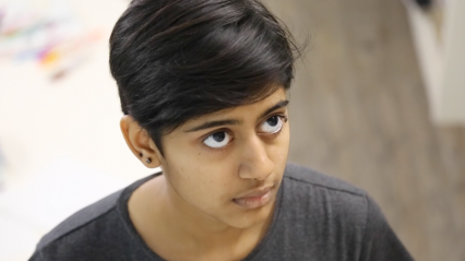
BEFORE
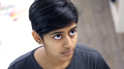
AFTER
I experimented with some color correction effects for the living room scenes, but eventually concluded that the scenes look fine just the way they are. There was nothing I could gain by adding any effects, because any addition looked artificial and I want to retain the realistic, unfiltered look and feel.
Editing: Audio
Over the past few days I finished laying out the background music for my short film. The audio editing not only involves the background music, but also the sound effects and dialogue. I added all the necessary effects such as the slap and the “thud” sound effects and synced them with the video. I also adjusted the volumes of the dialogue, sound effects and background music so that they were perfectly balanced. This audio mixing was a tricky process but I started to get the hang of it more and more as I went along.
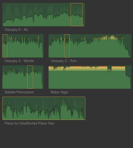
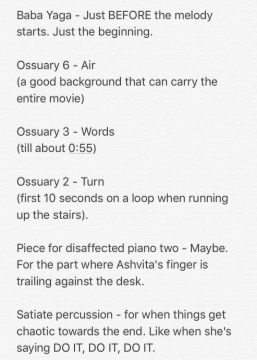
I will continue to tweak things and improve and adjust, but my basic framework is complete – audio and video. Out of the 6 tracks that I shortlisted, I ended up using 5 of them (all except Baba Yaga):
- Ossuary 6 – Air: This piece served as the general background music for almost the entire film. It has a great, low key sound that is both eerie and not attention grabbing. It was very useful to just have this in the background in the scenes where the mother and therapist are talking or when non-dramatic actions are taking place.
- Ossuary 3 – Words: I used this piece of music only one at the very beginning when the camera tilts up to Arya for the very first time. This music layered on top of Ossuary 6 creates an ominous sound that adds to the impact of the drama when Arya is revealed.
- Ossuary 2 – Turn: I used small portions of this piece whenever I needed a very dramatic musical cue at the climax of a scene. This was the music I used when Arya slapped Anamika and also when Ashvita throws the scrunched up paper in rage. I also used this when the mother and the therapist are running up the stairs as it adds to the tension of the moment.
- Piece For Disaffected Piano Two: This simple piano music was used when Ashvita was singing Twinkle Twinkle Little Star. The clunky sound of the piano keys playing against the discordant off-key sound of her voice has an eerie, mystical effect.
- Satiate Percussion: This percussion piece was the music I used every time Anamika glares at one of the alter-identities throughout the film. This piece of music is like a recurring motif that ties the entire film together. It was an intense, deep sound that perfectly fits the genre of the film and significantly heightens the dramatic tension of any scene that it is added to.


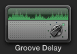
Transitioning smoothly between the different pieces of music and the dialogue proved to be one of the biggest challenges. It took a lot of intricate editing and timing to get it just right so that the audio would appear seamless and smooth. I used a lot of fade-in and fade-out to blend the different pieces of music together in a manner that wouldn’t be jarring. Another trick I used was the Groove Delay effect for when Ashvita is singing and also at the end when all the personalities are speaking at the same time. This effect doubles the audio, creating a faint echo that has a haunting, lingering sound.
The very beginning and the very end of the film have no music. The opening just has the sound of Arya’s feet hitting the closet for several seconds before the music slowly starts to fade in. This suggests that Anamika’s brain is silent as she sleeps and as she wakes up, the personalities slowly manifest one by one. Her brain slowly will get noisier but at this time, this is the only sound she hears. At the end, all the music stops and then Anamika says the words “I’m fine” followed by silence for several seconds. This conveys that when she says “I’m fine” in her own voice, all the other voices are shut out for an instant and there is quiet in her head. Having no music at the start and finish creates an ominous, chilling sound, and has the effect of coming full circle.
There is also no music when the last “DO IT” is heard, followed by the “thud”. This is to highlight the impact of the words and the intensity of the fall, and also convey that right before she jumps “DO IT” is the only thing that Arya (Anamika) hears. Everything blacks out for a second and she hears that command loud and clear and obeys it. The several seconds of silence following the jump when we see Arya (Anamika) on the floor are when her brain is shut off due to the impact of the fall. She is in shock and doesn’t hear anything and neither do the audience in that moment.
Finding background music
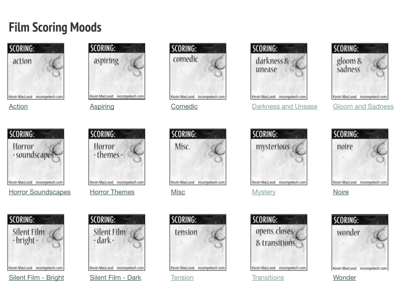
Today, I spent several hours trying to find the right background music for my film. I looked at a variety of different royalty free music sites, but found Incompetech (incompetech.com) to be the best and most convenient site. The way the music was organized made it very easy to browse by genre and theme and find tracks that best suited the atmosphere of my film. The site offers a very wide collection of tracks, all of which are available for free, which is another bonus. I opened all the collections that I felt would be relevant to my theme such as “Dark World”, “Darkness and unease”, “Gloom and sadness”, “mystery”, “tension”, etc. and listened to every single piece of music.
Once I did this, I was able to narrow the selection down to a few top choices and I jotted the names down in the Notes app on my iPhone. Along with the name, I also made quick notes about any thoughts I had regarding the music/where I felt it could best be used. Here are the notes:
All the music that I have chosen involves either synths or percussion instruments only. This is because I feel that these instruments best capture the tone of my film. The synths have a haunting, eerie sound while the percussion adds an element of drama and tension.
Now that I have these tracks selected, I will begin editing with them and see which ones actually work and which ones don’t. If I feel the need for any additional music, I will look that up later, but for now I feel comfortable with these choices. I feel they are perfectly fitting and will add a new dimension to my film.
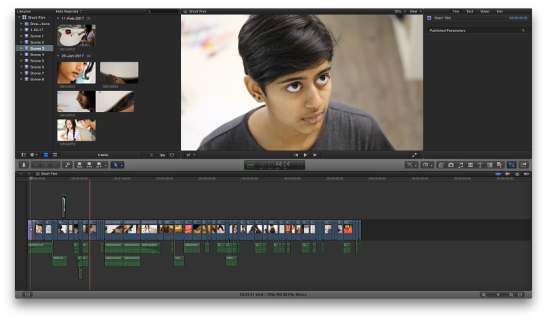
Cutting: Final Scenes
As of today, I have finished the process of cutting the raw footage for my film. All the ten scenes are laid out from beginning to end in Final Cut Pro X, and I was pleased to find that the total running time came to 4 minutes and 45 seconds. Once I add the title and credits, my short film will come to exactly 5 minutes long. This process of cutting the audio and video took a lot of time and patience, but the last two scenes in particular proved to be particularly tricky as they had the most intricate and complex editing sequences and techniques.


Scene 9:
In this scene, the film reaches its climax. Particularly towards the end of the scene, I used a lot of audio and video overlap in order to create rough, chaotic look that illustrates the confusion in Anamika’s mind. I had three separate audio tracks (cut up into smaller chunks for the sake of volume adjustments) running over each other, with each one becoming louder and softer at different intervals to show which voice was dominating in Anamika’s head.
I overlapped the 360 degree shot I took on top of the still shots of the individual personalities. I significantly increased the speed of the shot to 195% and then reduced the exposure so that it would be a faded, hazy video spinning in the background of everything else, adding to the sense of confusion. I also made use of the cross dissolve transition at the ends of the different video layers to ensure that they would blend into each other without creating a jarring effect. Correctly overlapping these different audio and video layers, was not an easy task, but I was finally able to achieve the look I intended.
Additionally, this was the scene with the slap. Getting the slap to look realistic and syncing it with the audio just right was another interesting exercise in editing. Having finally completed this sequence, I am happy with the final result.
Scene 10:
When editing this scene, I got to make use of two techniques that I had already practiced before and the practice certainly came in handy. One technique was “match-on-action” in the running up the stairs sequence. Anticipating the editing, I had already filmed the scene from all the necessary angles and was able to weave it together seamlessly and without too much difficulty.
The second technique was the disappearing effect. Again, I was able to do this without any trouble as I had practiced it a couple of times already and was comfortable with the method. I am very pleased with the way this technique looks in my final film and I think it will make the ending seem striking and memorable.
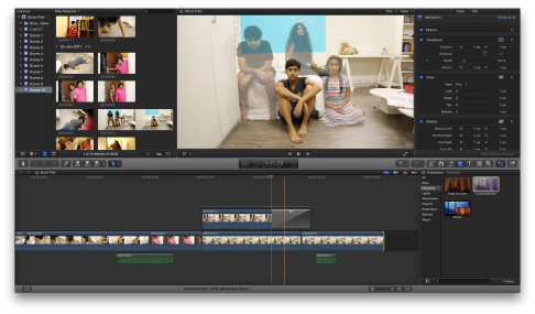
Cutting the footage
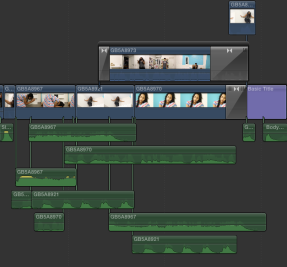
Having sorted all my footage, the next step is for me to cut the raw footage using Final Cut Pro X, and start building the basic structure of the film. Before starting work, I created a new ‘library’ and ‘project’ entitled “short film”. Then, I proceeded to work through the film scene by scene. I gathered all the footage that was part of one scene and transferred it to Final Cut, into an event titled with the scene number. Then I cut the footage from each scene and placed it on the timeline in a sequential manner. I also detached the audio from the video and cut it down to the correct length, and started adjusting the volume dynamics.
 For the past few days, I have been slowly working on this cutting process. I have finished doing 8 scenes out of ten in this manner. I plan to wrap this up very soon and move on to the next phase of editing. I still have to work on the background music, title sequence, credits, transitions, and colour correction.
Initially, I was worried about the length, and whether the film would fit comfortably into 5 minutes, but now I am optimistic. Having editing this far, I feel like I am on the right track and that the timing will work out almost perfectly.
Editing Software: Final Cut Pro X
The software that I have chosen to edit my short film is Final Cut Pro X. This seemed like the clear choice since I have used the software for all my preliminary tasks for this film as well as for other projects, making me comfortable and familiar with it. I am confident that I can use this software to achieve the visual effects needed, and that I will be able to execute the film as I visualized it. I also used Final Cut Pro X to edit last year’s AS Level coursework project, but I have done a lot of work with the software since then and I am now much more accustomed to it than before. I know more about it than I did previously, and will be able to create more complicated effects, as well as more precise coloring and lighting.
