Creative Critical Reflection

Question 1:

https://prezi.com/gtr7d0obes28/question-1-creative-critical-reflection/

Question 2:

https://prezi.com/fghdlpvh0are/question-2-creative-critical-reflection/

Question 3:

https://prezi.com/en91coj1b9em/question-3-creative-critical-reflection/

Question 4:

https://prezi.com/thp3_by2rjgq/question-4-creative-critical-reflection/

Critical Reflection: Software

I have decided to create individual presentations on Prezi for each of the four questions in the creative critical reflection. This is because I feel that Prezi will allow me to be creative, but also present my answers in a logical format. I want each presentation to have a different structure and look according to the question; I don’t want them all to look the same as that would be monotonous and boring.

Prezi feels like the best option for me as I am much more comfortable writing, designing and organizing than filming voiceovers/director commentaries. I feel that this choice will play to my strengths and give me a chance to express my ideas in the manner preferred by me. However, I have never used Prezi before, so I will have to learn how it works, but I don’t think that should be problem.

Short Film: Audience Review

Having finished editing “Split”, I sent it out via Whatsapp and Twitter to invite others to watch the film in order to get audience feedback. I didn’t conduct another Twitter poll (like I did for the website and postcard) because I wanted more specific, detailed responses from the audience. So, by sending the film individually to 30 people from different social and ethnic backgrounds, I could correspond with them one-on-one and find out what they thought.

On the whole, the responses were positive, with everyone saying they found the film to be entertaining and engaging. People generally seemed to like the aesthetic of the color scheme and lighting, and the editing. Nobody had trouble following the storyline or making sense of the ending, which was a personal relief to me. I wasn’t sure if people would get it, but they did, which made me happy. This assured me that the film was generally fine, and there was nothing major that I needed to change.

Here are some audience responses:

  • “The camera angles and lighting are really good.”
  • “The editing is accurate and the plot is also good. The only thing I would say is that there are maybe too many close-ups in the beginning. I know it adds to the plot, I’m just not a big fan of close-ups. But that’s besides the point. It was actually really good!”
  • “That was creepy good.”
  • “The editing was nice, especially in the last scene.”
  • “It’s really well portrayed, and I love the aesthetic. The frames and colors are so good. The end is perfect.”
  • “That was so well portrayed.”
  • “I found it interesting.”
  • “I liked the way you edited the dialogue and visuals together. The 360 degree shot was really cool to see.”
  • “I really like it because it has a very surreal feel in the beginning which helps you realize their psychosis. In a couple of places the music felt a little too dramatic, but it does add to the intense effect so it works. The special effects in the end is so good. I love the abstractness. A boom mic would’ve helped make the audio a little clearer.”
  • “It’s a really creative concept and the way you shot and unveiled everything is really cool.”

Website: Audience Review

After finishing my website, I wanted to conduct an audience review just like I did for the postcard so that I could see how people responded to the site. I wanted to make sure there were no glitches and that people found it easy to navigate. I held a twitter poll with a link to the site so that people could look through it and then answer the corresponding questions. I decided to use Twitter again because it worked really well last time and it gives me access to a large cross-section of people from around the world.

Here are the poll results:

Question 1)

Screen Shot 2017-04-07 at 6.56.23 pm

Question 2)

Screen Shot 2017-04-07 at 6.56.28 pm

Question 3)

Screen Shot 2017-04-07 at 6.56.32 pm

Question 4)

Screen Shot 2017-04-07 at 6.56.36 pm

Question 5)

Screen Shot 2017-04-07 at 6.56.40 pm

On the whole, all the results were very positive and I didn’t get any negative feedback regarding glitches, errors, etc. So, I concluded that the site is fine as it is and I don’t need to fix anything.

Postcard: Audience Review

Having finished designing my postcard advertisement, I decided to conduct an audience review to find out if any adjustments/ improvements needed to be made, and to find out the public’s reactions/opinions. I wanted to create a Twitter poll as the means of my survey because I knew that social media would enable me to reach a wide cross section of people from around the world. The survey was very successful and I was able to receive feedback from over 50 people of all different age groups, ethnicities and social backgrounds. I knew that this approach would be far better than just conducing a survey of my peer group in school because that would only allow me access to a limited sphere of society. Also, the Twitter survey would open me up to unfiltered, unbiased opinions that I could not get from friends or family.

Here are the results from the survey:
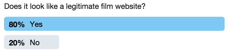
Question 1) 

Screen Shot 2017-04-04 at 8.13.56 pm

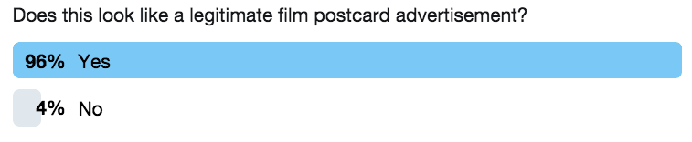
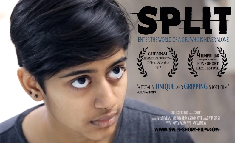
I was pleased to see that an overwhelming majority felt that the advertisement looks legitimate. I was satisfied that I done my job of creating a realistic looking film festival postcard.
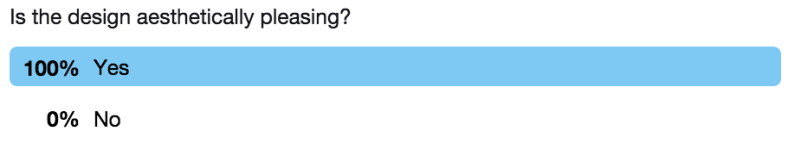
Question 2)

Screen Shot 2017-04-04 at 8.13.59 pm

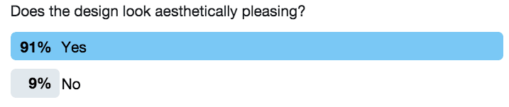
Again, here I was pleased to find that most people found the design aesthetically pleasing. In response to this question, I received a personal message from one participant who said that the only reason she voted no was because of the font I used for my tagline. She felt that I should not have used the same font I used as for my logo, and the moment she said this I realised it was true. I immediately went back and changed the font on the poster and subsequently on the website, and they both instantly looked better. I am really happy to have received such useful, constructive criticism. Catching flaws and making improvements such as this was a major reason for doing the survey in the first place, and I was glad to see that it paid off.
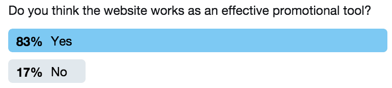
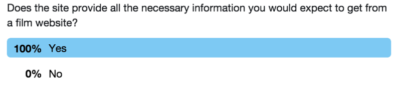
Question 3)

Screen Shot 2017-04-04 at 8.14.01 pm

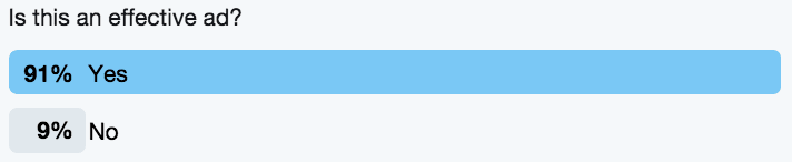
Since 91% said yes, I can be satisfied that my postcard will be an effective ad that will catch people’s attention and engage them.
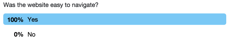
Question 4)

Screen Shot 2017-04-04 at 8.14.04 pm

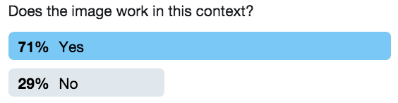
Here too I got a mostly positive response. Though some did feel the image doesn’t work, most of them did and I also feel that it works. I had to learn that it is impossible to win over everybody all the time and that as long as the clear majority was happy, I would be fine.

Question 5)

Screen Shot 2017-04-04 at 8.14.07 pm

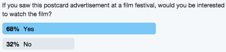
I was glad to see that most people said that this postcard advertisement would interest them in the film. It is very difficult to win over an audience, especially for a short film, as it does not have A-list stars or cool CGI special effects. Thus, under these circumstances, for an unknown film, starring unknown actors, it pleased me to see that people actually were interested in the film after seeing the poster. No film can appeal to everybody, but the fact that majority of the random public felt that the film looked appealing was enough to satisfy me.

On the whole, the Twitter survey went over well with me receiving positive responses on all the questions, which showed me that I was on the right track regarding my work. I have made the necessary adjustments to the postcard according to the results of the survey and I feel that this was a very useful and interesting exercise overall.

Postcard Ad: Backside

Screen Shot 2017-04-03 at 1.44.05 pm

Screen Shot 2017-04-03 at 1.44.05 pm

This is the backside of my postcard advertisement that I designed using Adobe Photoshop CS6. I decided to create a double-sided postcard so that I could include additional information on the back such as film festival screening times, contact details and a QR code. I felt that this would be the most logical and convenient approach because that way, all the essential information regarding the film and how to view it would be in one place. Otherwise, I would theoretically have to hand out separate business cards along with the postcard and that could get confusing. Filmmakers and executives who have attended a host of film festivals have almost unanimously agreed that it is very important to have contact information and film festival information on the postcard itself. They have said that this makes it easier for everyone, and I agree.

I have lifted the film festival screening information from the ‘Film Festivals’ page of my website. It is laid out in exactly the same way, in a neat format that fits perfectly into a rectangle. Thus, the information is conveyed in a very clear and unambiguous manner This very important as people need to be able to know where and when to watch the film in order for the film to build an audience. Then, on the bottom left corner I have my contact details – email and phone number. Having this information here, rather than on a separate business card is wise because this way, people will be able to directly associate me with the film and be able to reach out more easily.

Finally, in today’s increasingly digital day and age, a QR code is a very useful component to include in a film festival postcard. With the QR code I can directly tie together the postcard and the website and build an effective and synchronised marketing campaign. I generated the QR code using the site goqr.me .

The background colour is the same colour as the hardwood floor in the background of the image on the front. I selected this particular colour from that photo using the ink dropper tool on Photoshop so that I would be able to attain exactly the right shade. I wanted to have this colour as the background so that the front and back would have a clear visual correlation and look aesthetically pleasing as a single piece. I kept the layout simple, neat and elegant with all the text in black. I didn’t want the back to look as dynamic as the front as then the actual poster-side of the card would lose it’s power.

Postcard Ad: Front Page

Screen Shot 2017-04-02 at 4.18.27 pm

Today, I designed the front side of my postcard advertisement using Adobe Photoshop CS6. I used the same cover photo as on the homepage of my website. I have selected this as the official banner photo of my film as it is powerful and eye-catching. This way, upon seeing this photo anywhere, people will be able to immediately associate it with the film. The title of the film is featured in large letters as this is the aspect on the poster that has to really jump out and attract attention.

Under the title, I have the tag line of the film, the film festival laurels, as well as a quoted review. These are conventional features on most posters and postcard advertisements. The title, tag line and film festival laurels are positioned in almost the same way as on the website. This way, the entire marketing campaign has a distinct look and style. The various elements work together in building an identifiable brand. I have taken the quoted review from the “Acclaim” page on the website. Having the words “unique” and “gripping” be in a larger font and in blue makes these words stand out. These are the key words, and they are thus the most eye-catching. This ensures that the review does not get lost on the postcard.

Screen Shot 2017-04-02 at 4.18.27 pm

At the bottom of the postcard, as per convention, I have the production credits featured in a small, white font. Below that is a link to my film website. The font is larger here and the lettering is in black. This helps to differentiate the link from the production credits and make sure that viewers spot it. It is important to have the link be featured in a noticeable way as this is what helps enable cross-promotion and technological convergence.

Just as in the website, I have limited the colours used to black, white, and blue. These colours work together well to create an aesthetically pleasing poster that looks balanced and sophisticated. I have also tried to align the text in a manner that doesn’t look cluttered. All the text on the top and on the bottom seem to fit into two neat boxes, with the lines beginning and ending in the same place. This simple format ensures that the postcard doesn’t come off looking messy or disordered. For this same reason, I have also decided to simply stick with the landscape format. This image doesn’t work in a portrait format and I wouldn’t be able to design an effective postcard.